The Golden Rules of Wedding Colors
Your color palette ties everything together — the venue, the flowers, the attire, even your display pieces. Get it right and the whole event feels cohesive. Get it wrong and things look scattered. Here's how to nail it.
Timeless Combinations That Always Work
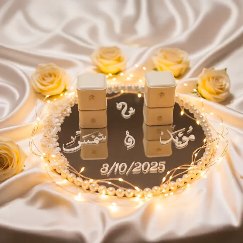
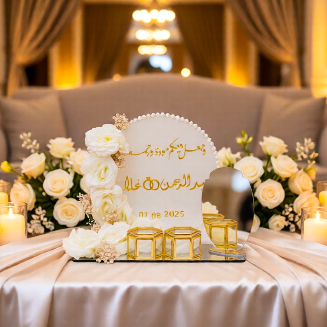
- Gold & Cream — The AmeerArt signature. Warm, luxurious, and photographs beautifully. Works in every season and any venue. Pair with white florals and candlelight.
- Blush Pink & Gold — Soft, romantic, and feminine. Perfect for spring/summer weddings. Rose displays and blush drapery complete the look.
- Navy & Gold — Regal and dramatic. Navy tablecloths with gold accents, gold calligraphy displays, and white floral pops create a stunning contrast.
- White & Greenery — Clean, modern, organic. All-white displays with eucalyptus and olive branch accents. Works beautifully in outdoor venues.
- Burgundy & Gold — Rich, warm, and perfect for fall/winter. Deep red roses on gold mirror trays look absolutely incredible.
- Sage Green & Cream — Earthy and elegant. A softer alternative to white and greenery that feels more intimate.
Trendy Palettes for 2026
- Terracotta & Dusty Rose — Desert-inspired warmth with boho elegance.
- Mocha & Champagne — Neutral tones that feel sophisticated without being boring.
- Lavender & Silver — A dreamy, modern twist on the classic purple wedding.
- Black & Gold — Bold, dramatic, unforgettable. Our dark heart stand was made for this palette.
Combinations to Avoid
- Red & Orange — Too aggressive together. If you love red, pair it with gold or cream instead.
- Too many pastels — More than 3 pastel colors looks washed out. Pick one main pastel and ground it with a neutral.
- Silver & Gold — Mixing metals can work in fashion, but in wedding decor it usually looks like two different weddings collided. Pick one.
- Neon anything — It's a wedding, not a rave. Keep it elegant.
- All white everything — It can look sterile. Add warmth with gold accents, greenery, or candles.
How to Test Your Palette
Before committing, gather fabric swatches, flower samples, and photos in your chosen colors. Look at them together in both natural light and warm indoor lighting (which is what your venue will have). Take a phone photo — if it looks good on screen, it'll look good in person.
Matching Your Display to Your Palette
- Warm palette (golds, creams, blush)? Gold hoop stands, gold mirror trays, warm-toned dried flowers.
- Cool palette (silvers, blues, lavender)? Rhinestone crystal trays, silver calligraphy, white flowers.
- Dramatic palette (blacks, burgundy)? Dark heart stands, smoked mirror pieces, deep red roses.
- Minimalist palette (whites, greens)? Simple pearl trays, clean white bases, orchid accents.